Optimising AI-Powered semiconductor process analysis
Optimizing AI-Powered Semiconductor
Process Analysis
Panoptes VM improvement
Panoptes VM (Virtual Metrology) is a web-based AI tool for monitoring semiconductor manufacturing processes.
I was responsible for improving the UI/UX of the VM application, which focuses on visualizing and analyzing complex process data.
My main goals were to restructure the UX to support user workflows, improve the intuitiveness of data-driven interfaces, and help users visually understand and manage complex flows in the semiconductor manufacturing process.

Role
Product Designer
Tools
Figma, Notion, Zeroheight
Team
1 Designer, 2 PMs, 2 Developers
1 Designer, 2 PMs,
2 Developers
1 Designer, 2 PMs,
2 Developers
Duration
May 2024 – April 2025
Problem & Approach
VM users must manage multiple modeling tasks and track complex semiconductor data.
However, the original UI was fragmented and unintuitive and lacked scalability for frowing workflows.
Frequent edits, context switching, and inconsistent table and filter structures created unnecessary effort and user fatigue.
As the platform scaled, the lack of a design system further limited usability and collaboration with developers.
To address these issues, I focused on simplifying interactions, reducing visual overload, and designing flexible, scalable UI structure through close collaboration with users, PMs, and engineers.
VM users must manage multiple modeling tasks and track complex semiconductor data.
However, the original UI was fragmented and unintuitive.
Frequent edits, context switching, and inconsistent table-filter structures created unnecessary effort and user fatigue.
As the platform scaled, the lack of a design system further limited usability and collaboration with developers.
To solve this, I aimed to simplify interactions, reduce visual overload, and design a scalable UI structure through close collaboration with users, PMs, and engineers.
VM users must manage multiple modeling tasks and track complex semiconductor data.
However, the original UI was fragmented and unintuitive.
Frequent edits, context switching, and inconsistent table-filter structures created unnecessary effort and user fatigue.
As the platform scaled, the lack of a design system further limited usability and collaboration with developers. To solve this, I aimed to simplify interactions, reduce visual overload, and design a scalable UI structure through close collaboration with users, PMs, and engineers.
Recipe Sequence: Challenge 1 & Approach
Recipe Sequence:
Challenge 1 & Approach
Recipe Sequence:
Challenge 1 & Approach
Disconnected workflows & limited scalability
Steps were fragmented and failed to support equipment expansion or diverse process logic
Disconnected workflows & limited scalability
Steps were fragmented and failed to support equipment expansion or diverse process logic
Disconnected workflows & limited scalability
Steps were fragmented and failed to support equipment expansion or diverse process logic
Workflow-oriented UI restructuring
Simplified fragmented steps and redesigned the structure for flexible equipment and process expansion.
Workflow-oriented UI restructuring
Simplified fragmented steps and redesigned the structure for flexible equipment and process expansion.
Workflow-oriented UI restructuring
Simplified fragmented steps and redesigned the structure for flexible equipment and process expansion.
Recipe Sequence: Challenge 2 & Approach
Recipe Sequence:
Challenge 2 & Approach
Recipe Sequence:
Challenge 2 & Approach
Repetitive operations & context-switching fatigue
Frequent context switching and excessive interactions, especially in complex table and filter combinations
Repetitive operations & context-switching fatigue
Frequent context switching and excessive interactions, especially in complex table and filter combinations
Repetitive operations & context-switching fatigue
Frequent context switching and excessive interactions, especially in complex table and filter combinations
Process visualisation & streamlined input flows
Reduced unnecessary interactions and clarified step-by-step configurations to create a more intuitive flow.
Process visualisation & streamlined input flows
Reduced unnecessary interactions and clarified step-by-step configurations to create a more intuitive flow.
Process visualisation & streamlined input flows
Reduced unnecessary interactions and clarified step-by-step configurations to create a more intuitive flow.
Table & Filters: Challenge & Approach
Table & Filters:
Challenge & Approach
Table & Filters:
Challenge & Approach
Poor data exploration & fragmented hierarchy
The 3-depth table and disconnected filter layout slowed exploration and increased visual clutter.
Poor data exploration & fragmented hierarchy
The 3-depth table and disconnected filter layout slowed exploration and increased visual clutter.
Poor data exploration & fragmented hierarchy
The 3-depth table and disconnected filter layout slowed exploration and increased visual clutter.
Simplified IA for efficient data exploration
Reduced depth (3 → 2), refined table structure, and improved filter layout for a faster, more focused flow.
Simplified IA for efficient data exploration
Reduced depth (3 → 2), refined table structure, and improved filter layout for a faster, more focused flow.
Simplified IA for efficient data exploration
Reduced depth (3 → 2), refined table structure, and improved filter layout for a faster, more focused flow.
Design System: Challenge & Approach
Design System:
Challenge & Approach
Design System:
Challenge & Approach
Lack of UI scalability, consistency & collaboration
Without a design system, inconsistent UI made scaling and collaboration difficult.
Lack of UI scalability, consistency & collaboration
Without a design system, inconsistent UI made scaling and collaboration difficult.
Lack of UI scalability, consistency & collaboration
Without a design system, inconsistent UI made scaling and collaboration difficult.
Design system implementation & documentation
Built shared UI components and style guidelines to improve scalability and collaboration.
Design system implementation & documentation
Built shared UI components and style guidelines to improve scalability and collaboration.
Design system implementation & documentation
Built shared UI components and style guidelines to improve scalability and collaboration.
Research & Validation
How might we?
How might we design a scalable structure that supports new EQP types and complex workflows?
How might we design a scalable structure that supports new EQP types and complex workflows?
How might we design a scalable structure that supports new EQP types and complex workflows?
How might we simplify repetitive setup steps to make configurations more intuitive?
How might we simplify repetitive setup steps to make configurations more intuitive?
How might we simplify repetitive setup steps to make configurations more intuitive?
How might we help users explore and filter complex data in a unified way?
How might we help users explore and filter complex data in a unified way?
How might we help users explore and filter complex data in a unified way?
User Research & Testing
Research
I interviewed 3 data engineers and 2 key users to understand how they explored and configured models.
I interviewed 3 data engineers and 2 key users to understand how they explored and configured models.
• Single- step canvas couldn’t scale for multi-recipe flows or new equipment (EQP) types.
• Frequent context switching between canvas, panels, and modals created significant setup fatigue
• Only 2 of 10 users adopted filters due to a disconnected UI most preferred direct search.
• Single- step canvas couldn’t scale for multi-recipe flows or new equipment (EQP) types.
• Frequent context switching between canvas, panels, and modals created significant setup fatigue
• Only 2 of 10 users adopted filters due to a disconnected UI most preferred direct search.
Testing
I conducted quick validation sessions with domain users to evaluate clarity and efficiency of the new design.
I conducted quick validation sessions with domain users to evaluate clarity and efficiency of the new design.
• Template cards made equipment selection clearer and more intuitive.
• Modal-based configuration flow felt faster and less tiring than frequent panel switching.
• Unified filter layout was easier to locate and use for data exploration.
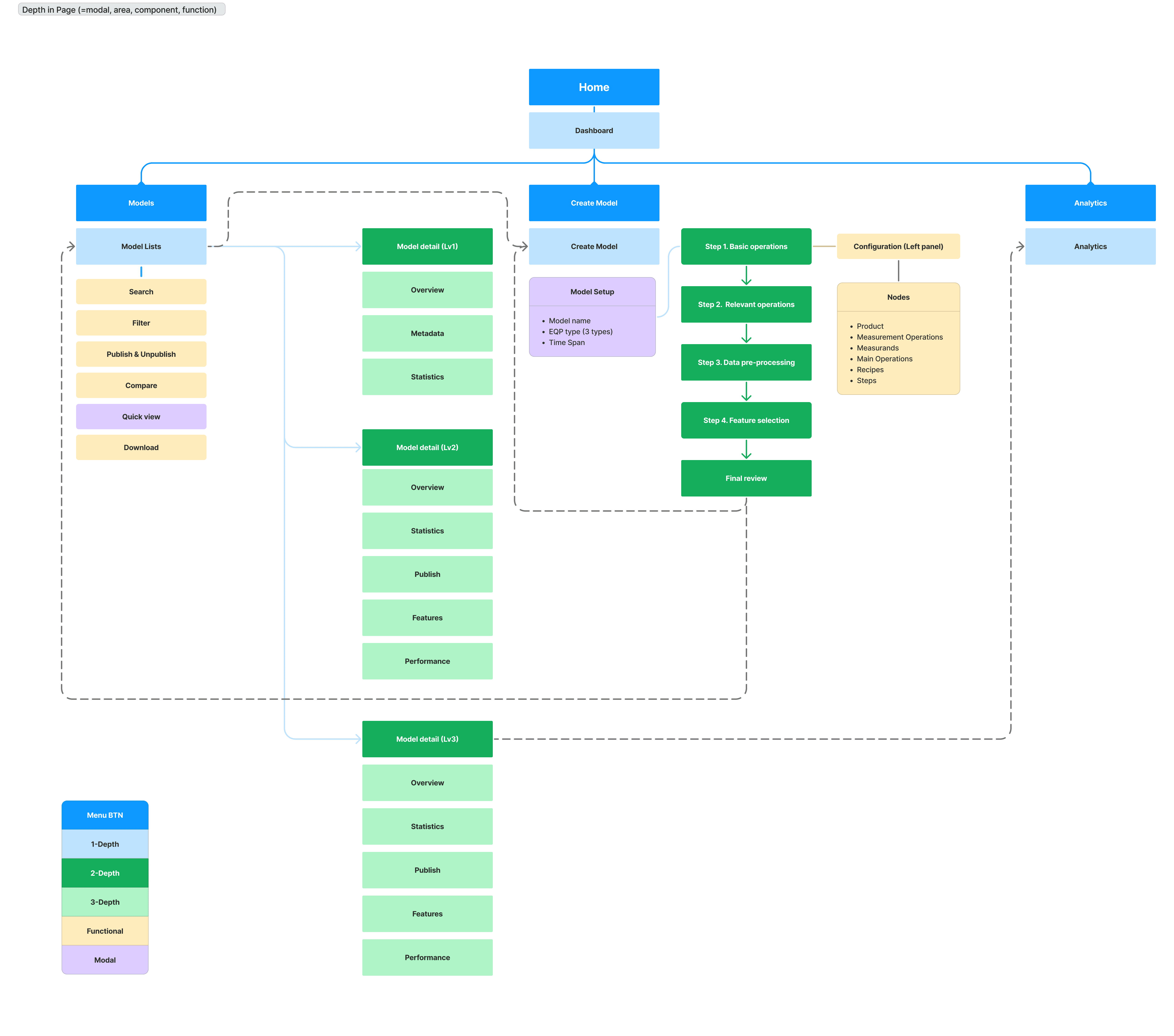
Information Architecture
The redesigned IA shifted the model creation flow from a modal-centric layout to an integrated, node-based system.
Flattening hierarchy and moving EQP setup into in-page cards made the structure more scalable and intuitive.
The redesigned IA shifted the model creation flow from a modal-centric layout to an integrated, node-based system.
Flattening hierarchy and moving EQP setup into in-page cards made the structure more scalable and intuitive.
Before
Before
Before

After
After
After
Rebuilding the UX around process logic
The ‘Recipe sequence’ feature was introduced to reflect actual semiconductor process flows across multiple recipes and chambers.
The original VM system, limited to single-step analysis, could not represent these interconnected processes.
To address this, I redesigned the equipment template card UI on the model creation page — replacing unrelated thumbnails with clear icons and labels to improve clarity and scalability. This redesign enhanced model recognition, simplified selection, and established a scalable framework for future growth.
※ In semiconductor manufacturing, a recipe refers to a predefined process flow, and a chamber is the equipment unit where each step runs.
※ In semiconductor manufacturing, a recipe refers to a predefined process flow, and a chamber is the equipment unit where each step runs.
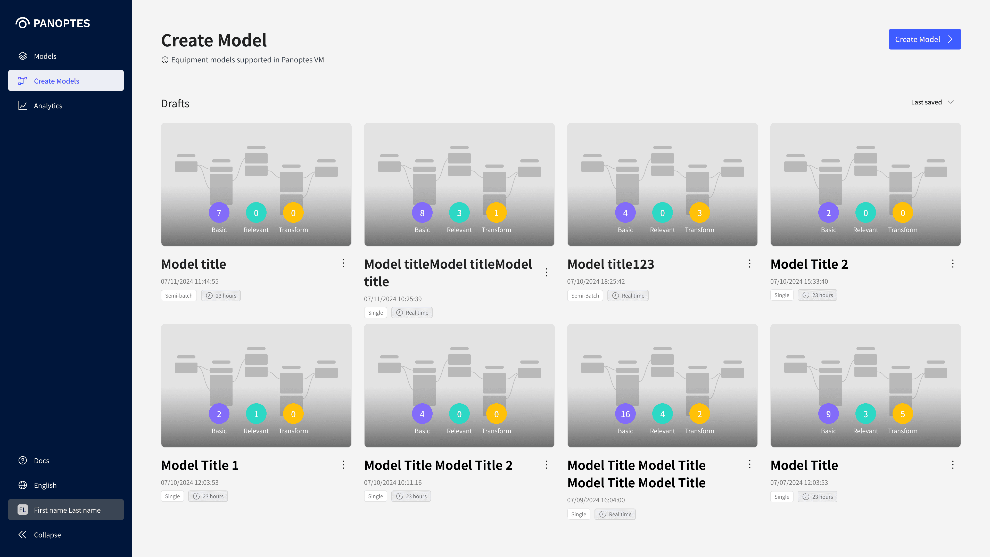
Before
Single process model–centered screen
• Structure limited to single model
• Unclear equipment types & configurations
• Irrelevant preview images
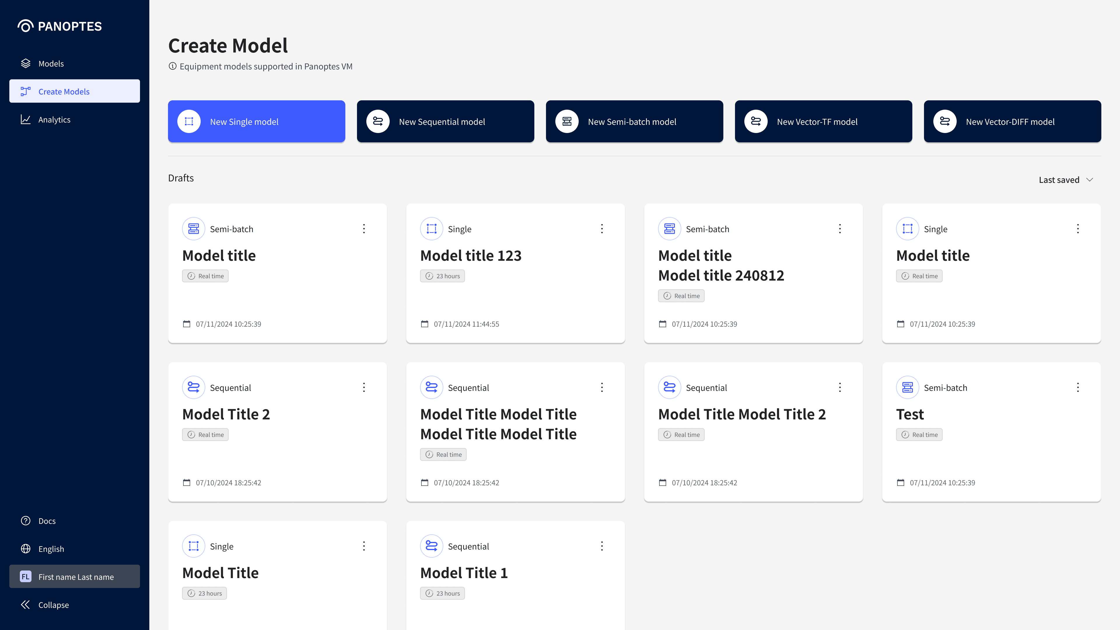
After
Multi-recipe chamber structure
• Template card UI for scalable equipment
• Clear and intuitive model type selection
• Preview images replaced with icons & labels
Canvas structure to support recipe-step flows
Canvas structure improvement
The original step configuration screen displayed nodes horizontally, which made recipe flows difficult to follow and required frequent mouse movement to the left panel for detailed inputs.
To improve this, I redesigned the canvas with a vertical hierarchy (Main Operation > Recipe > Step) and modal-based inputs to remove unnecessary actions. This new structure enhances visual clarity, reduces repetitive effort, and helps users better understand relationships across recipes.
The original step configuration screen displayed nodes horizontally, making recipe flows difficult to follow and requiring frequent mouse movement to the left panel for detailed inputs.
To improve this, I redesigned the canvas with a vertical hierarchy (Main Operation > Recipe > Step) and modal-based inputs to cut unnecessary steps.
This structure enhances visual clarity, reduces repetitive effort, and helps users better understand relationships across recipes.

Before
Original canvas configuration screen
• Nodes aligned horizontally with left panel
• Grouping not intuitive
• Excessive mouse movement for node settings

After
Improved for multi-recipe configuration
• Vertically aligned nodes for clearer flows
• Hierarchical grouping to show process relationships
• Node settings handled directly in modal windows
Step configuration
In the original design, step details had to be configured in a left-side panel, leading to excessive mouse movement.
I simplified this by having “New” or “Edit” actions open a modal, making the process more direct and efficient.
To support recipe sequence requirements, I introduced a chip-based combo box for step configuration, along with a toggle to switch between shared and individual settings. This reduced repetitive effort and provided flexibility for different process conditions.
In the original design, step details had to be configured in a left-side panel, causing excessive mouse movement.
I simplified this by having “New” or “Edit” actions open a modal, making the process more direct and efficient.
To support recipe sequence requirements, I introduced a chip-based combo box for step configuration, with a toggle to switch between shared and individual settings.
This reduced repetitive effort and provided flexibility for different process conditions.
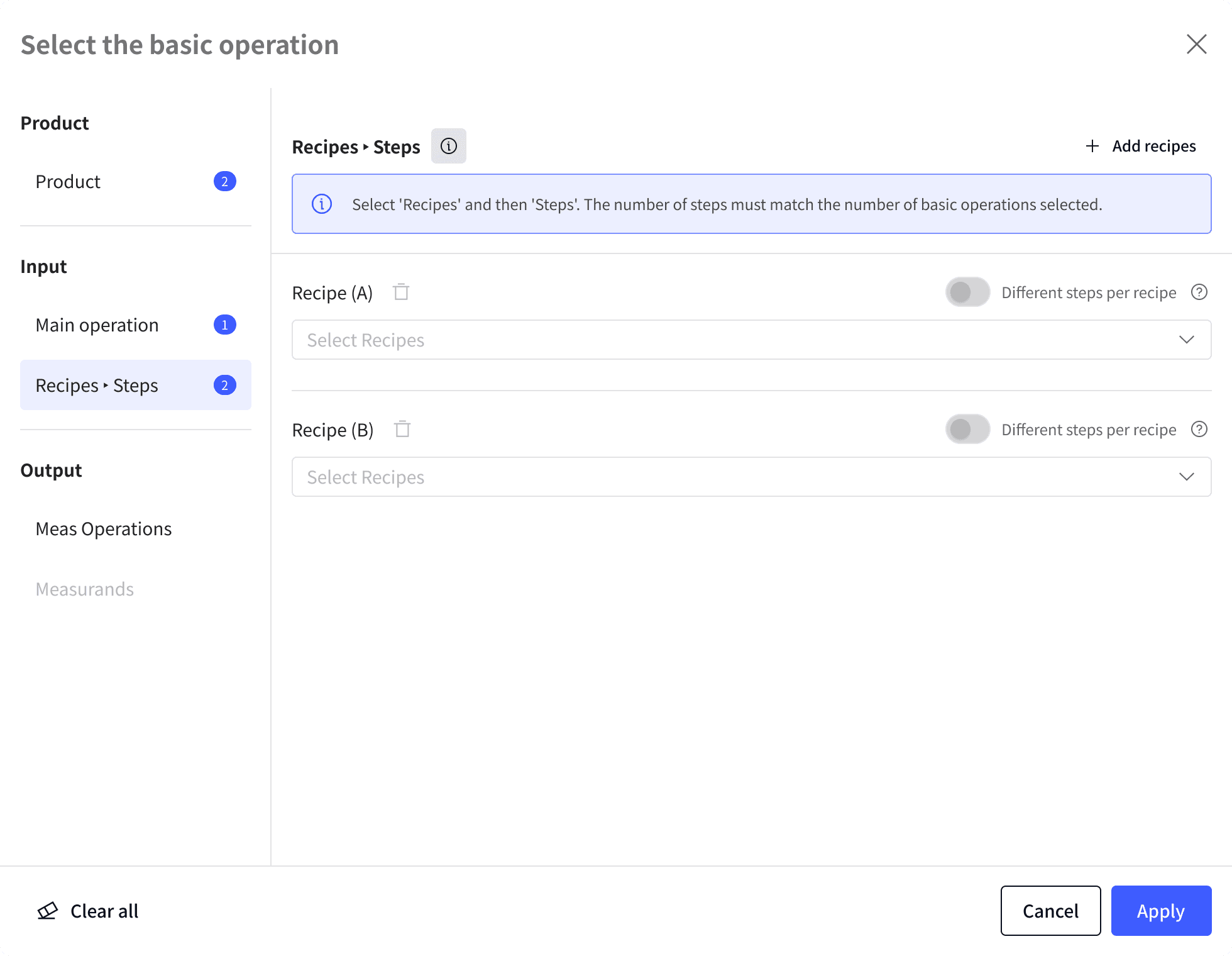
1
Initial State
After selecting the Main Operation, the system provides a basic structure for group-based recipe input.
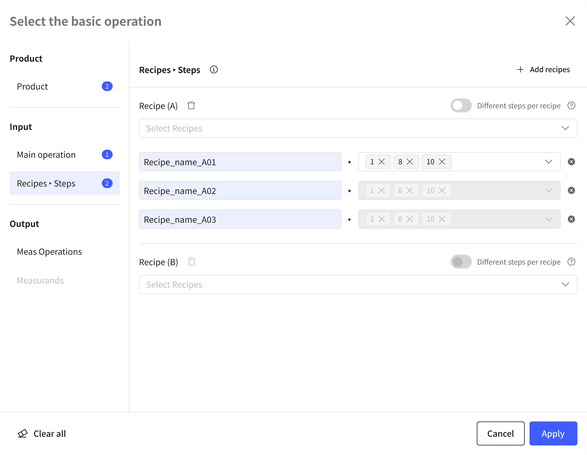
2
Common Step Setting
When a recipe is selected, the configuration is visualized in a list format, allowing users to manage common step settings across multiple recipes.
When a recipe is selected, the configuration is visualized in a list format, allowing users to manage common step settings across multiple recipes.

3
Individual Step Setting
Steps are designed with a Chip-style UI, where users can toggle individual step configurations for each recipe when needed.
Table & filter improvement
The original table contained too many columns and scattered action buttons, making data hard to scan.
The filter was also visually disconnected and used space inefficiently.
To improve this, I refined the information architecture and reorganized the table around key data, displaying actions on row hover and enabling double-click for details. I also positioned the filter closer to the table, applied an accordion for condition settings, and fixed the “Save/Edit” buttons for clarity.
These changes improved visual consistency, streamlined the data exploration flow, and helped users stay focused during repetitive tasks.

Before
Original table & filter UI
• Too many table columns
• Action buttons taking separate row space
• Table and filter visually disconnected
• Too many depth levels with overlapping information
• Tab-style filters with poor readability & usability

After
Improved table & filter interactions
• Reorganized columns around key information
• Simplified actions via row hover & double-click
• Visually connected table and filter areas
• Simplified IA by reducing depth and refining the table
• Accordion UI with fixed action buttons
Building a design system
As new features and screens were added, the UI’s consistency began to break down and component reuse became difficult across teams.
To address this, I built a design system centered on core components, managing structures, and documenting guidelines to enable systematic workflows. This improved UI consistency, maintenance efficiency, and cross-team collaboration.
As new features and screens were added, UI’s consistency began to break down and component reuse became difficult across teams.
To address this, I built a design system centered on core components, managing structures, and documenting guidelines to enable systematic workflows.
This improved UI consistency, maintenance efficiency, and cross-team collaboration.


Key results & insights
This project allowed me to turn a complex and unfamiliar domain into clearly structured visual flows.
I gained hands-on experience collaborating with PMs, developers, and data engineers to shape scalable UX.
Through building the design system, I came to understand the importance of systemic thinking and how it impacts collaboration speed, maintenance efficiency, and global communication.
Key results
Key results
Key results
01
Improved workflows and scalability with vertical, hierarchical structure
01
Improved workflows and scalability with vertical, hierarchical structure
01
Simplified fragmented steps and redesigned the structure for flexible equipment and process expansion
02
Minimised navigation and simplified configurations with modal-based inputs
02
Minimised navigation and simplified configurations with modal-based inputs
02
Simplified fragmented steps and redesigned the structure for flexible equipment and process expansion
03
Enhanced data exploration efficiency through refined table and filter structures
03
Enhanced data exploration efficiency through refined table and filter structures
03
Simplified fragmented steps and redesigned the structure for flexible equipment and process expansion
04
Enhanced UI consistency, collaboration, and maintenance via design system
04
Enhanced UI consistency, collaboration, and maintenance via design system
04
Simplified fragmented steps and redesigned the structure for flexible equipment and process expansion
© 2025 Portfolio
© 2025 Portfolio
© 2025 Portfolio