Designing a circular UX for sustainable logistics

PaaS operations app design project

PaaS (Packaging as a Service) is a platform for managing eco-friendly reusable packaging and supporting circular logistics.
I was responsible for designing the UI/UX of three separate mobile apps: operator, driver, and consumer tailoring flows to the specific context of each role.
The design goal was to simplify core functions for efficiency and apply a shared design system to ensure brand consistency and maintainability across all apps.
Role
UI/UX Designer
Tools
Sketch
Team
1 Designer, 1 PMs, 2 Developers
1 Designer, 2 PMs,
2 Developers
1 Designer, 2 PMs,
2 Developers
Duration
August 2020 – November 2020

Design considerations & approach

The PaaS project already had an overall service flow defined, but when I joined the team, the app-level UX drafts and UI designs were still incomplete.
My goal was to design role- and scenario-based flows for operators, drivers, and consumers, simplify core functions for efficiency, and establish a consistent design system across all apps.
To achieve this, I worked closely with PMs to refine user flows, reduced key tasks into minimal steps, and applied a shared component-based design system to ensure consistency and long-term maintainability.

VM users must manage multiple modeling tasks and track complex semiconductor data.

However, the original UI was fragmented and unintuitive. 


Frequent edits, context switching, and inconsistent table-filter structures created unnecessary effort and user fatigue. 


As the platform scaled, the lack of a design system further limited usability and collaboration with developers.
To solve this, I aimed to simplify interactions, reduce visual overload, and design a scalable UI structure through close collaboration with users, PMs, and engineers.

Role & Workflow:
Challenge & Approach
Role and scenario-based workflows

Apps needed to reflect different user roles and contexts

Role and scenario-based workflows

Apps needed to reflect different user roles and contexts

Disconnected workflows & limited scalability

Steps were fragmented and failed to support equipment expansion or diverse process logic

Role-focused workflow design

Structured each app around its user role and context.

Role-focused workflow design

Structured each app around its user role and context.

Role-focused workflow design

Structured each app around its user role and context.

Core Functions:
Challenge & Approach
Brand Consistency:
Challenge & Approach
Efficiency of core functions

Key tasks had to be simple and fast

Efficiency of core functions

Key tasks had to be simple and fast

Consistent brand experience across apps

Consistency was critical for usability and teamwork.

Minimal steps

Simplified tasks into fewer steps for efficiency.

Minimal steps

Simplified tasks into fewer steps for efficiency.

Shared design system

Consistent components for brand unity and easier upkeep

Brand Consistency:
Challenge & Approach
Core Functions:
Challenge & Approach
Consistent brand experience across apps

Consistency was critical for usability and teamwork.

Consistent brand experience across apps

Consistency was critical for usability and teamwork.

Repetitive operations & context-switching fatigue

Frequent context switching and excessive interactions, especially in complex table and filter combinations

Shared design system

Consistent components for brand unity and easier upkeep

Shared design system

Consistent components for brand unity and easier upkeep

Shared design system

Consistent components for brand unity and easier upkeep

System flow overview

Starting from the official service planning document and scenario-based personas, I analyzed and restructured the service flow from a UX perspective.
The redesign focused on addressing three key issues:
repetitive NFC tagging, unclear return tracking, and inefficient handovers across the three mobile apps.

Operator app

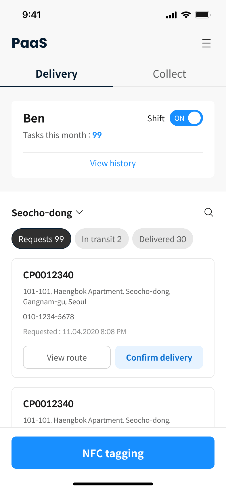
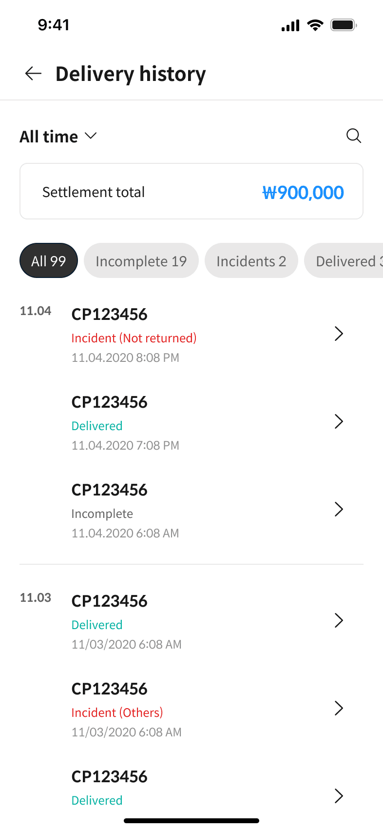
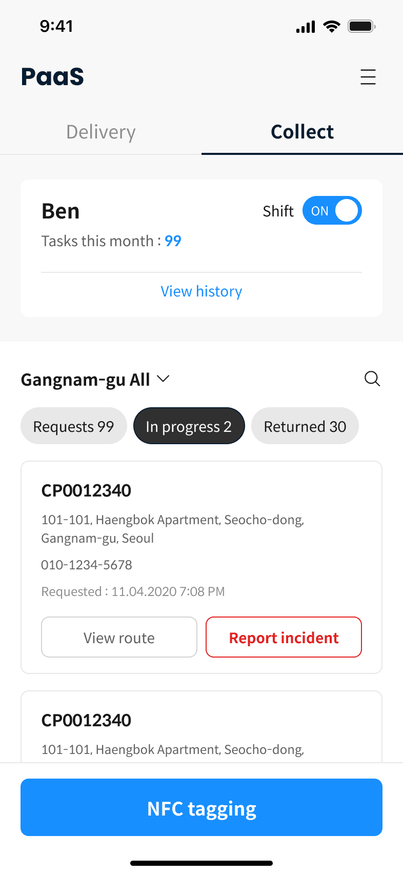
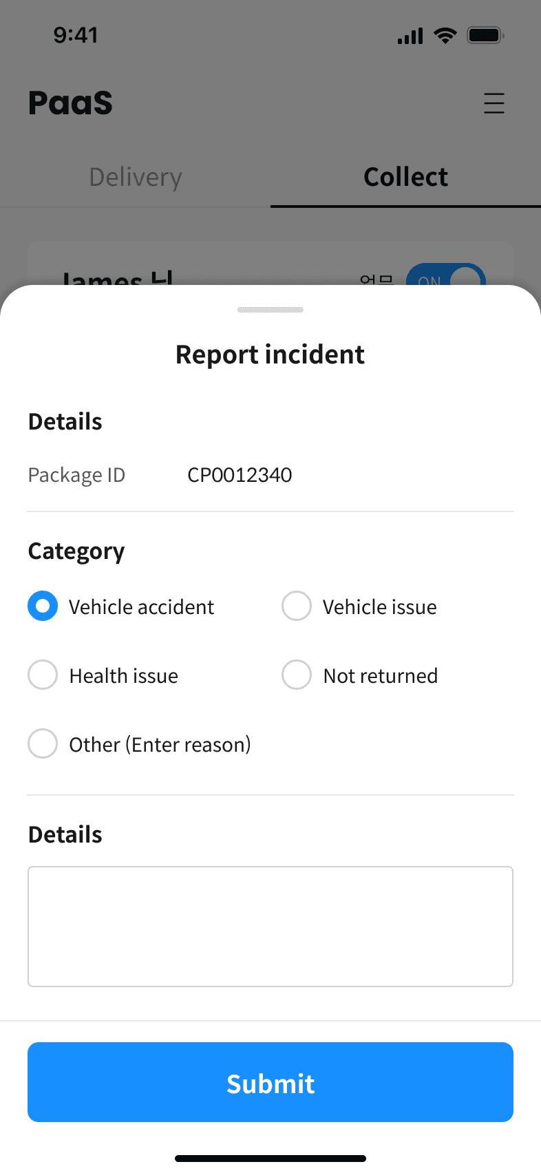
Delivery&Collection app

Consumer app

Service flow

※ This flow was analysed and restructured from the official service planning document from a UX perspective.

Persona

Adam - Logistics Operator (35)

Roles

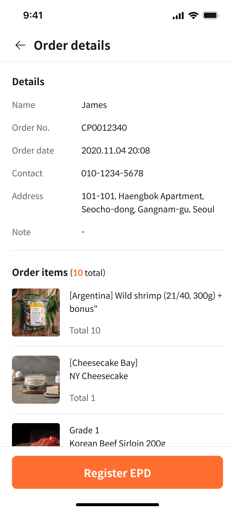
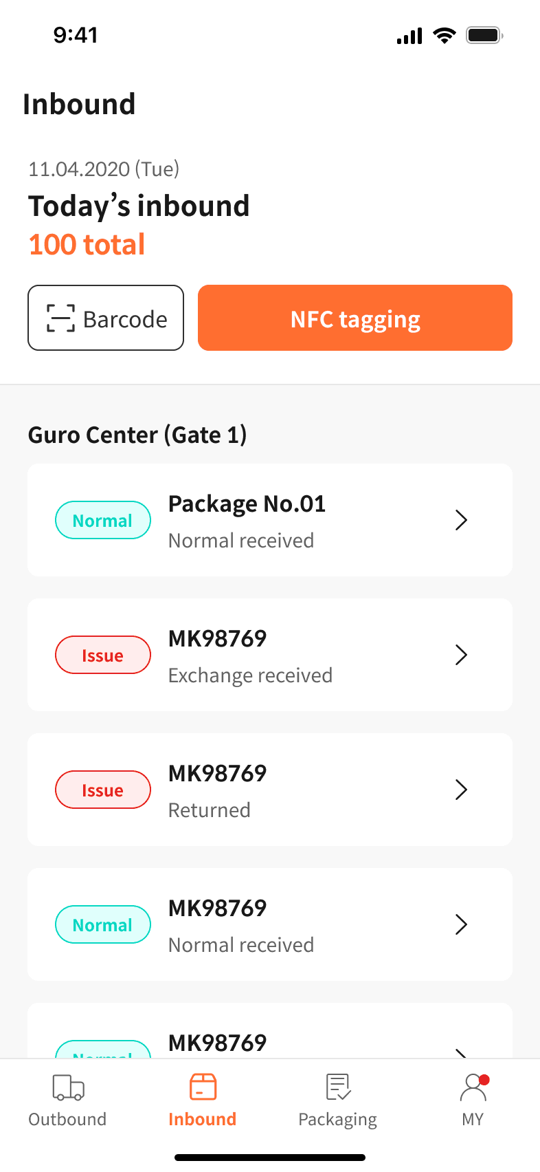
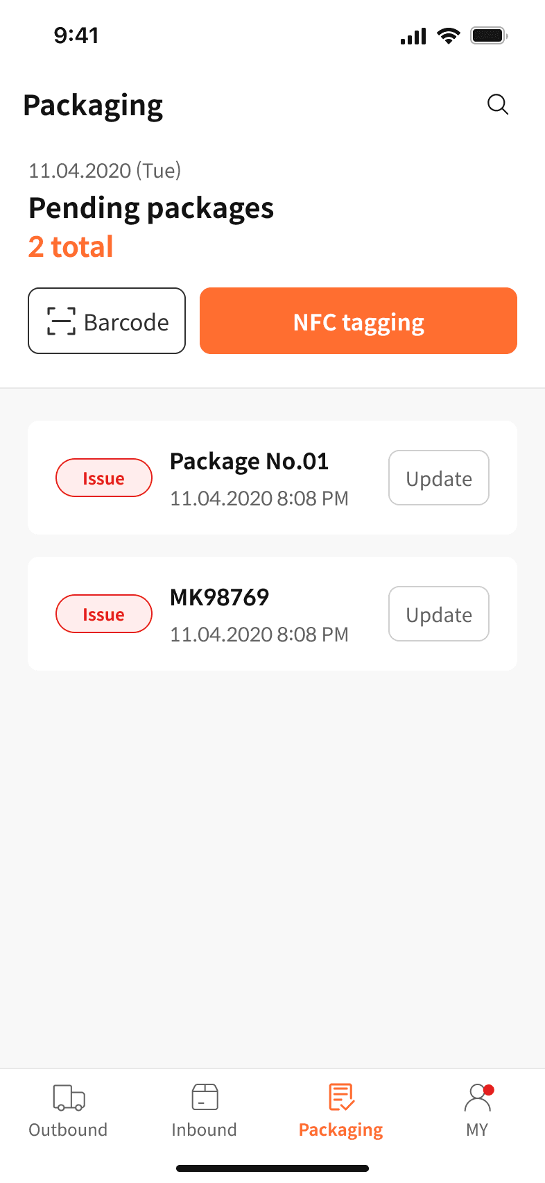
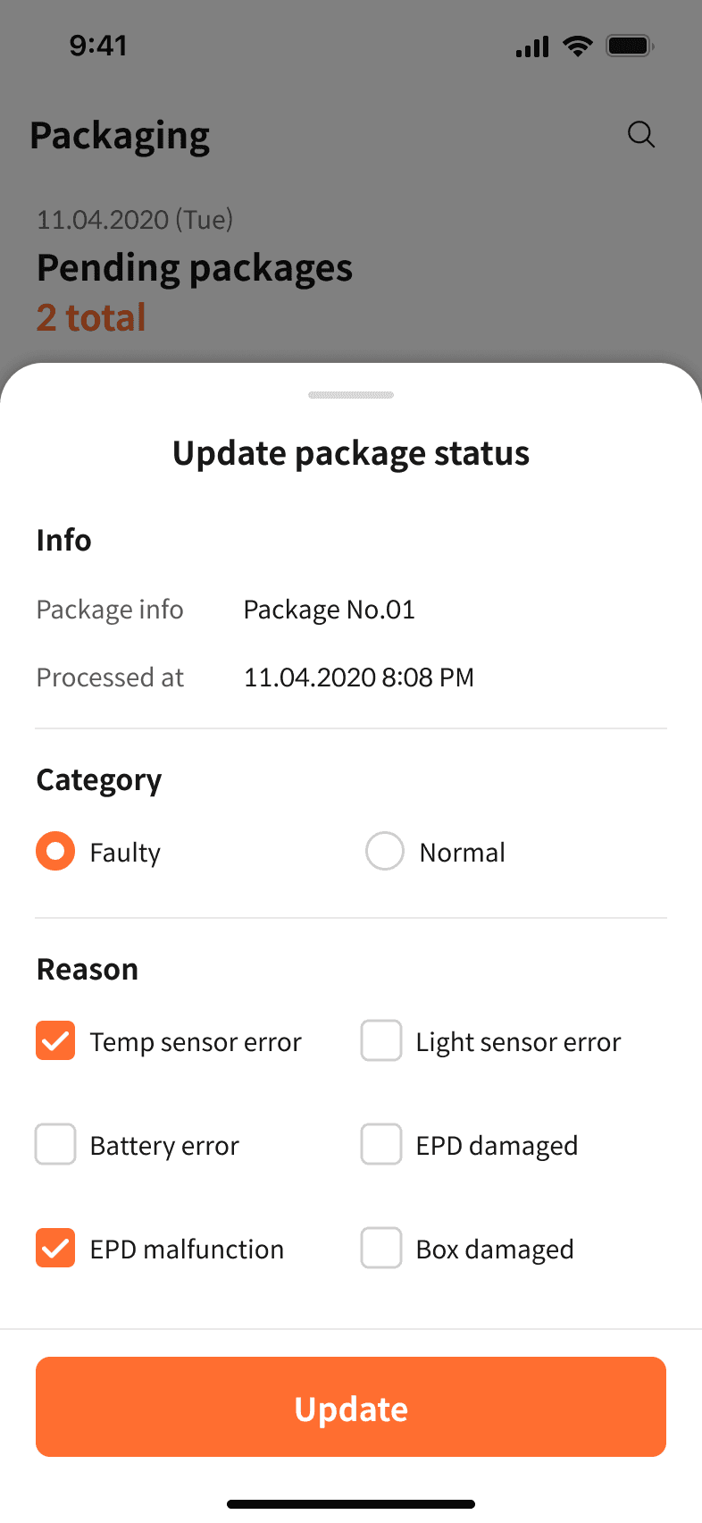
Manages package intake, release, and returns

Goals

Handle 300+ scans daily with accuracy and speed

Pain Points

Repetitive tasks and error-prone manual checks

Ben - Logistics Operator (42)

Roles

Handles deliveries and pickups on the go

Goals

Update tasks quickly and reduce repetitive NFC tagging

Pain Points

Tagging fatigue, update delays, unclear exceptions

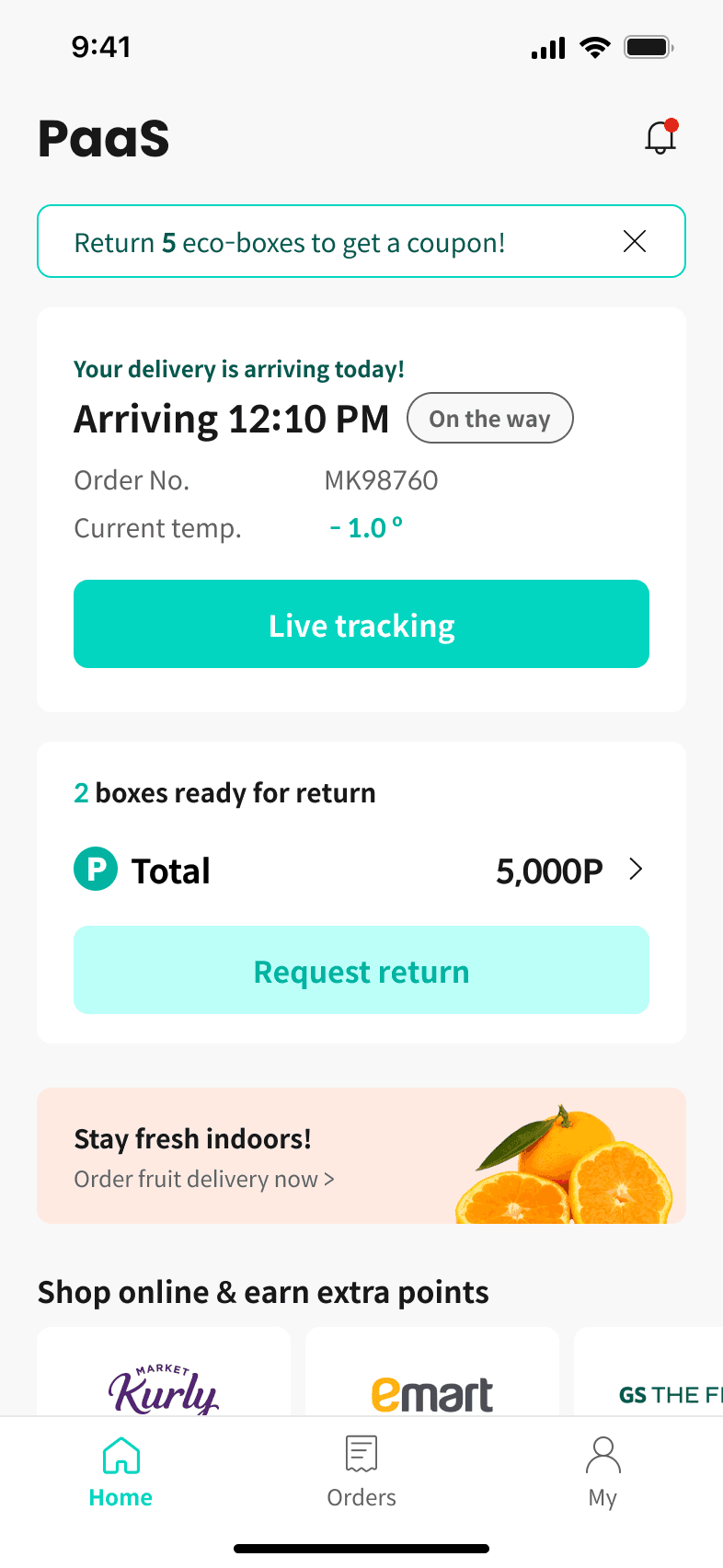
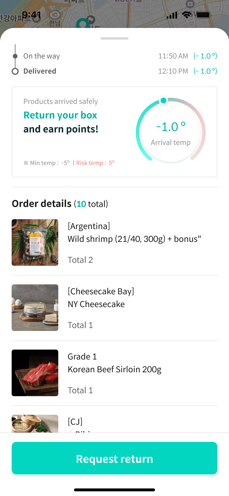
Chloe - Eco-Friendly Consumer (29)

Roles

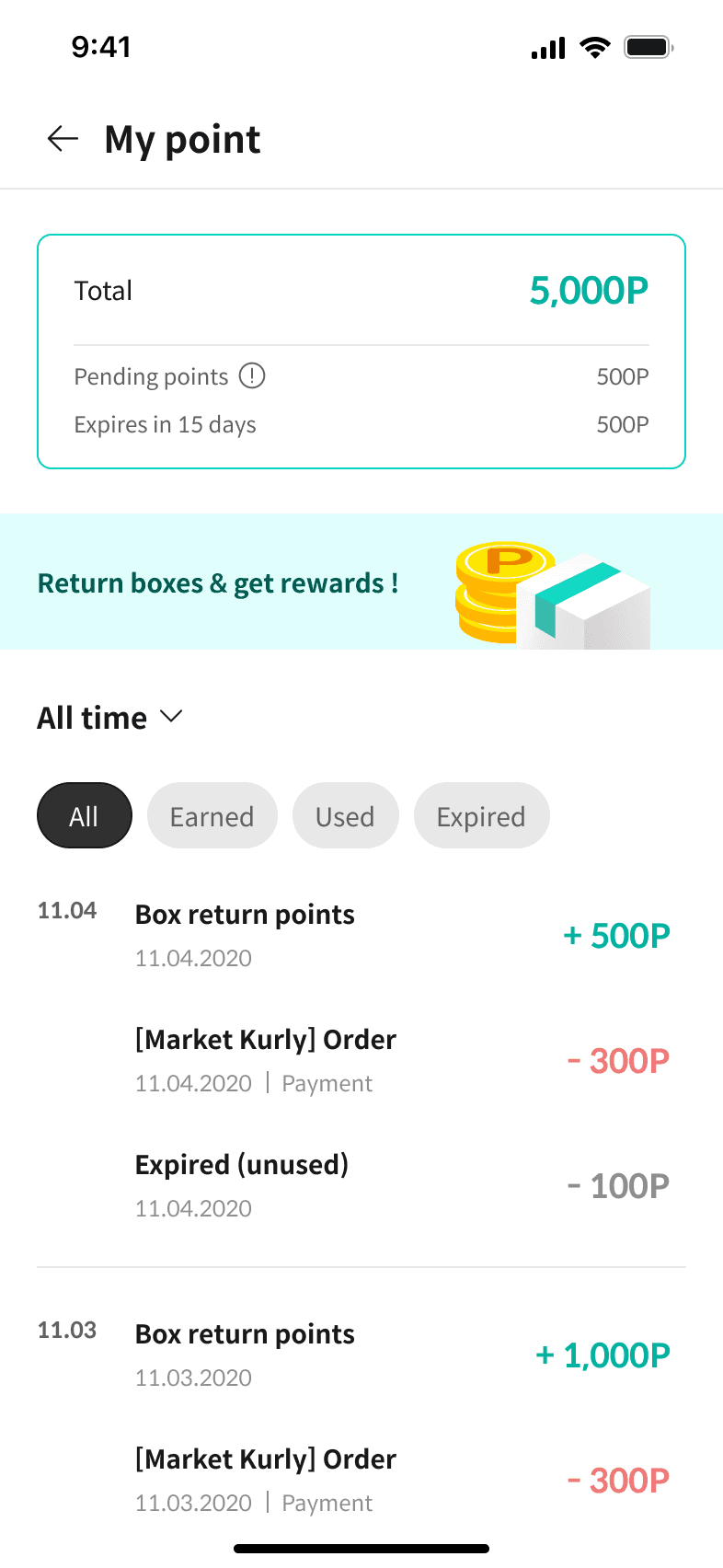
Tracks deliveries, Requests returns, Earns rewards

Goals

Simple return process and trustworthy reward system

Pain Points

Complicated return flow and unclear reward tracking

Complicated return flow and unclear reward tracking

※ These personas were scenario-based representations to guide design priorities, not results of formal user research.

Optimised app for packaging operations

The Operator App was designed for logistics center staff to monitor inbound package conditions in real time and quickly classify abnormal ones.
Sensor data such as temperature, light, and battery levels — were visualized to make status checks more intuitive and defect handling faster.
NFC registration and barcode scanning were placed at the top of the workflow to simplify repetitive tasks.
The UI was designed with simple flows and minimal interactions in mind, focusing on both efficiency and accuracy in daily operations.

Unified app for delivery & collection

The Delivery & Collection App was designed to combine both workflows into a single interface, using intuitive tabs and a state-based UI so drivers could see task status at a glance.
A fixed bottom button was introduced for repetitive NFC tagging to make handling faster.
Key functions such as ON/OFF toggles, status tabs, and period filters were integrated within the same screens to keep interactions simple.
The overall structure was intended to help drivers complete tasks efficiently while minimizing effort in daily operations.

Designing a user-driven UX flow from pickup to reward

Real-time tracking, rewards, and sustainable brand experience

The Consumer App was designed to intuitively connect the flow from delivery tracking to return requests, encouraging eco-friendly actions and repeat engagement.
Real-time route, temperature, and status data were visualized on a map to build trust in the cold-chain process.
Reward experiences were introduced to naturally motivate ongoing participation in the system.
Custom isometric illustrations were applied across key screens to strengthen the brand experience.

The Consumer App was designed to connect the flow from delivery tracking to return requests intuitively, encouraging eco-friendly actions and repeat engagement.


Real-time route, temperature, and status data were visualised on a map to build trust in the cold chain process.


Reward experiences were considered to naturally motivate ongoing participation in the system.

Custom isometric illustrations were applied across key screens to strengthen the brand experience.

Reward participation based on order History

The Consumer App was structured so that users could track both delivery and return progress directly from their order history.
Unreturned items were highlighted with action buttons, while exception cases triggered top-screen alerts so users could quickly re-request returns.
When a return was completed, reward points were automatically credited and clearly displayed, naturally encouraging repeat participation in the return process.

Designing a scalable cross-app design system

To improve UI consistency and maintenance efficiency, I built a design system in Sketch applied across the operator, delivery/collection, and consumer apps.
Key UI elements, such as brand colors, iconography, typography, and buttons were defined to reinforce visual consistency and provide a seamless user experience across apps.
Using Sketch’s symbol library, I systematically managed components and created reusable UI patterns to support collaboration and long-term maintainability.

Key results & insights

In the PaaS project, I designed the UI/UX and app structures to reflect different user roles and operational scenarios.
Through this process, I recognized the importance of considering user flows across the entire service journey,
and learned that building a design system from the early stage of UI component design is critical for long-term maintainability.

In the PaaS project, I designed the UI/UX and app structures to reflect different user roles and operational scenarios.


Through this process, I recognised the importance of considering user flows across the entire service journey,

and learned that building a design system from the early stage of UI components is critical for long-term maintainability.
Key results
Key results
Key results
01

Structured apps around user roles and workflows to match operational needs

01

Structured apps around user roles and workflows to match operational needs

01

Simplified fragmented steps and redesigned the structure for flexible equipment and process expansion

02

Reduced core tasks into minimal steps for efficiency and ease of use

02

Reduced core tasks into minimal steps for efficiency and ease of use

02

Simplified fragmented steps and redesigned the structure for flexible equipment and process expansion

03

Applied a component-based design system for consistency and maintainability

03

Applied a component-based design system for consistency and maintainability

03

Simplified fragmented steps and redesigned the structure for flexible equipment and process expansion

© 2025 Portfolio

© 2025 Portfolio

© 2025 Portfolio